The Impact of Window Treatment Color on Room Psychology and Mood
Insider Tricks, Tips, and the Latest from the #ShadesGuru
Window Treatment Color Psychology: How Colors Affect Your Room
Have you ever considered how the colors of your window coverings impact your mood? Studies suggest that colors can influence your heart rate and blood flow. The colors surrounding us significantly affect our feelings and well-being. Let’s explore the fascinating world of window treatment color psychology and discover how choosing the right hues for your window coverings can completely transform a room’s atmosphere.
Understanding Window Treatment Color Psychology
It’s like a chromatic mind trick, delving into how colors influence our actions and emotions. By understanding this, you can create spaces that evoke your desired feelings. Window treatment colors are powerful, occupying significant visual space and interacting with incoming light to amplify the existing mood.
Therefore, choose your window treatment colors thoughtfully. Consider the purpose of the room and the atmosphere you want to create. A bedroom, intended for relaxation, benefits from calming colors. A home office, on the other hand, might need bolder hues to boost productivity. Selecting the right window treatment color enhances both the functionality and aesthetic appeal of a space.
The Psychology of Primary Shade Colors
The primary colors—red, blue, and yellow—form the foundation of all colors. Each carries its own unique psychological associations. Incorporate them into your interior design using window treatment colors:
Red: Energy and Passion
Red is a bold color associated with energy, passion, and excitement. Considering window treatment color psychology, red introduces warmth and drama. Red window treatment colors are best suited for areas where activity and liveliness are desired, such as dining rooms or game rooms. However, use red sparingly, as too much can create feelings of agitation.
Blue: Calm and Serenity
Blue evokes feelings of calmness, peace, and tranquility. Exploring window treatment color psychology, blue creates relaxing environments. Blue window treatment colors are ideal for bedrooms, bathrooms, and studies—spaces that require quiet and focus. Light blues create an airy feel, while deeper blues convey sophistication and serenity.
Yellow: Joy and Optimism
Yellow is the color of sunshine, radiating happiness and optimism. Examining window treatment color psychology, yellow creates a welcoming atmosphere. Yellow window treatment colors can brighten up kitchens, living rooms, and children’s rooms—areas that benefit from a cheerful ambiance. But be cautious, as excessive yellow can be overwhelming.
The Psychology of Secondary Shade Colors
Combining the primary colors creates secondary colors—green, orange, and purple. These offer greater control in shaping the room atmosphere. Using them in window treatment colors allows for precise mood manipulation:
Green: Nature and Balance
Green represents nature, growth, and balance. Studying window treatment color psychology, green promotes harmony. Green window treatment colors work well in most rooms, from relaxing living rooms to restful bedrooms, fostering a sense of tranquility. Light greens are invigorating, while dark greens are grounding.
Orange: Enthusiasm and Warmth
Orange combines the energy of red with the happiness of yellow, creating a vibrant and inviting atmosphere. Considering window treatment color psychology, orange promotes warmth and enthusiasm. Orange window treatment colors are excellent for social spaces—living rooms and dining rooms—where conversation is encouraged. However, use orange in moderation to avoid overwhelming the space.
Purple: Luxury and Creativity
Purple suggests royalty, sophistication, and creativity. Investigating window treatment color psychology, purple adds a touch of elegance. Purple window treatment colors are suitable for bedrooms, studies, and meditation spaces—areas that seek tranquility and inspiration. Light purples are soothing, while deep purples are dramatic.
The Impact of Neutral Shade Colors
Neutral hues—white, black, gray, and beige—serve as the foundation of many designs. They can either temper brighter colors or enhance a sense of sophistication. Analyzing window treatment color psychology, neutral hues subtly influence the room atmosphere without being overpowering.
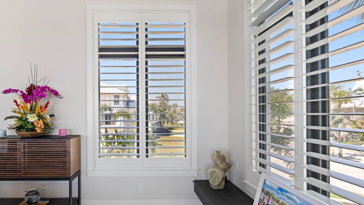
White: Purity and Simplicity
White represents purity and simplicity. Understanding window treatment color psychology, white creates a sense of spaciousness and light. White window treatment colors are versatile and suitable for any room, especially those with limited natural light. They reflect light, making rooms feel larger. However, white can sometimes feel sterile, so add warmth through textures.
Black: Sophistication and Power
Black conveys sophistication and drama. Observing window treatment color psychology, black creates depth and contrast. Black window treatment colors are most effective when used sparingly. They can make a room feel smaller, so use them to highlight artwork or architectural features. Balance black with lighter hues.
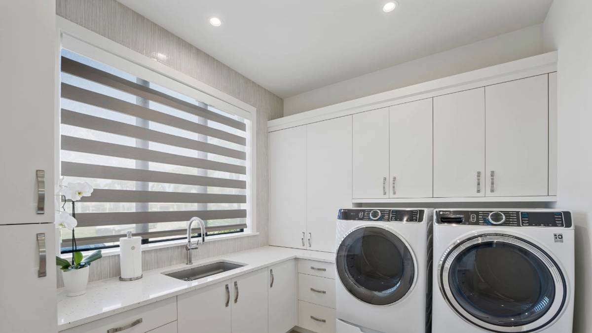
Gray: Elegance and Neutrality
Gray is versatile, ranging from cool and calming to warm and cozy. Analyzing window treatment color psychology, gray adds sophistication and balance. Gray window treatment colors are at home in any room. Light grays create an airy feel, while deep grays add depth and drama.
Beige: Comfort and Warmth
Beige is inviting, promoting comfort and relaxation. Exploring window treatment color psychology, beige creates a cozy atmosphere. Beige window treatment colors are ideal for living rooms and bedrooms—spaces that prioritize relaxation. However, beige can sometimes feel bland, so add visual interest with patterns and textures.
How Shade Colors Impact Different Rooms
Window treatment colors affect each room differently. Understanding how colors interact is crucial for making informed window treatment colors choices.
Living Rooms: Social and Inviting
Living rooms are gathering spaces for family and friends. When considering window treatment color psychology, living rooms benefit from warm hues that encourage conversation. Orange, yellow, and green create a welcoming atmosphere. Beige and gray add sophistication. Red and purple can add a touch of excitement.
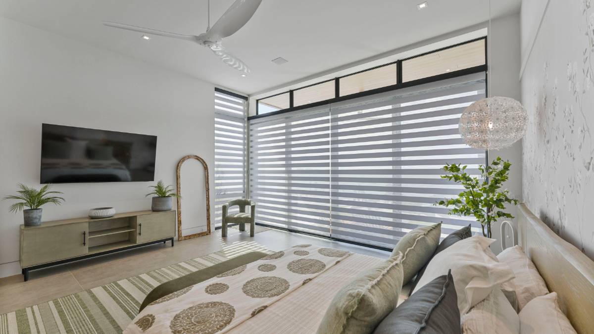
Bedrooms: Peaceful and Relaxing
Bedrooms are sanctuaries for rest and rejuvenation. When tracking window treatment color psychology, bedrooms need soft hues that promote sleep. Blue, green, and lavender calm the mind. White and beige create a sense of serenity. Avoid red and orange, as they can be stimulating.
Kitchens: Bright and Cheerful
Kitchens are the heart of the home, fueling families. When you’re on the lookout for window treatment color psychology, kitchens thrive with bright hues that boost energy. Yellow, orange, and light green cheer up the cooks. White creates a sense of spaciousness. Avoid dark hues, as they can make the space feel smaller.
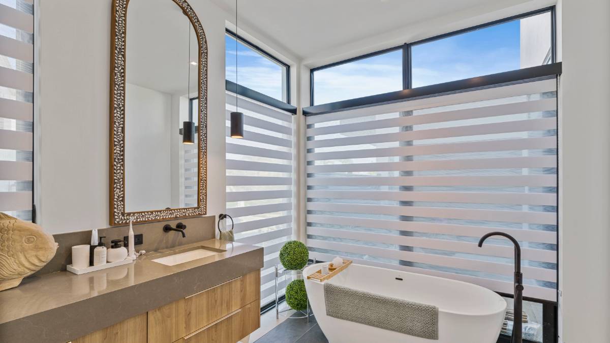
Bathrooms: Clean and Refreshing
Bathrooms are spaces for cleansing and relaxation. When you’re clued into window treatment color psychology, bathrooms need clean hues that promote tranquility. White, blue, and green evoke a spa-like atmosphere. Gray and beige quiet the mind. Avoid bold hues, as they can feel overwhelming.
Home Offices: Productive and Focused
Studies are spaces for work and concentration. When you’re picking up on window treatment color psychology, studies benefit from hues that enhance productivity. Blue, green, and gray calm the mind. Avoid bold hues, as they can be distracting. Add plants for a touch of nature.
Tips for Choosing the Right Shade Colors
Selecting window treatment colors can feel overwhelming. Use these tips to create spaces that reflect your personal style:
- Define the room’s purpose: What activities take place in the room? What mood do you want to create?
- Consider the existing decor: What colors are already present in the room? How will window treatment colors complement them?
- Assess the lighting: How much natural light does the room receive? How will window treatment colors affect the light?
- Test your choices: Before making a final decision, test window treatment colors in the room. Observe how the light affects them at different times of day.
- Trust your instincts: Understand the principles of color psychology, but ultimately choose window treatment colors that you love! Let your personal style shine.
The Future of Shade Color’s Mental Effects in Interior Design
As our understanding of color psychology deepens, it will increasingly influence interior design. Technological advancements will lead to new window treatment colors and innovative ways to create spaces that support our mental well-being. Smart blinds that adjust color based on mood and shades that display custom artwork are just a glimpse of what’s to come. The future is bright for window treatment color psychology!
In Conclusion
Window treatments significantly impact room vibes. Understanding window treatment color psychology allows you to create spaces that evoke calm, passion, creativity, and happiness. Blue is calming, yellow is cheerful, and gray is sophisticated. The right window treatment colors can transform your home into a haven that reflects your personal style. Consider each room, assess the existing decor, and test your choices. Then, create your perfect world!